In this post I want to have a quick look at the colour wheel and why it is such a useful tool in photography
I Can See a Rainbow
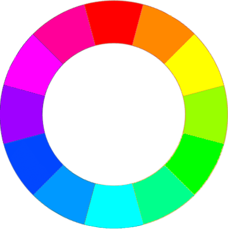
As you can see from the image above, the colour wheel contains colours from around the visible spectrum arranged into different coloured blocks. There is nothing there that you won’t have seen before but what is important about the colour wheel is where the different colours are placed within it.
Analogous Colours
The colours are arranged around the wheel whereby colours of a similar hue are placed next to each other e.g. yellow sits next to orange, and cyan sits next to blue etc.
These are called analogous colours and they are colours that have low colour contrast. i.e. when analogous colours sit next to each other in an image, they blend with each other rather than stand out from each other.
So, if for instance, you pick yellow from the wheel, you can see that the colours at either side of it (the analogous colours) are orange and lime green. So if any of these two colours were to sit next to yellow in an image, they would blend in and have low contrast.
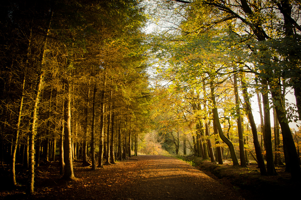
Here is an example of this below. The orange colour of the leaves is analogous with the yellow on the trees, and this is analogous to the green in the leaves. Thus, there is little colour contrast in this image.
Colour Harmony
Because of the low colour contrast between analogous colours, images which mostly contain them have a harmonious colour scheme which is often desirable. For example, shots taken at sunrise or sunset often have a strong analogous colour scheme because the orange light from the sun renders the landscape at similar hues. And we all know how popular these types of photos are.
There are plenty of ways to help make colours analogous to each other which I will look at in a later post.
Complimentary Colours
You could probably view complimentary colours as being the opposite of analogous colours. These colours are directly opposite from each other on the colour wheel e.g. blue and yellow, or red and cyan. When mixed together complimentary colours produce grey, and when placed next to each other in an image they give the strongest colour contrast. So it can be said that the further a colour is from another in the colour wheel, the stronger the contrast between the two is.
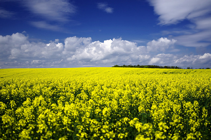
Here is an example below. The blue of the sky is the complimentary colour of the yellow in the field. Thus, these two elements stand of from each other significantly.
Colour Disharmony
Because of the strong colour contrast with complimentary colours (or any two colours that are far apart on the colour wheel) you have to think carefully about how you use them in your images. The strong colour contrast can be used to give emphasis to an important object in your image and help it to stand out. However, too often you will see images with masses of strong colour contrasts and they just end up looking messy because of this.
Again, I will look at how to create and use these colour contrasts in a future post.
Watch the Wheel
That was just a brief overview of the colour wheel. It is a simple to understand tool but very useful when grading colours within your images as it helps you assess which colours are going to contrast heavily or not, and this is really vital when thinking about your image composition.
In the next post on colour, I will have a look at colour contrast in images and how these affect the composition.
Thanks for Reading,
Neil


Leave a comment