Don’t worry, this post is not about ‘blue sky thinking’ as in the corporate, execu-speak drivel that you hear people spouting, which supposedly has something to do with creative ideas or something like that. I am literally going to have a short discussion about blue sky’s in landscape images.
Blue Abounds
If you are in the northern hemisphere you will be in the height of summer just now. And if it is anything like the UK, it will be one of the hottest, driest summers in memory. With these long, hot, dry days comes sunny weather and plenty of blue sky. I have spoken about this in a previous post and how it can affect your photographs, but today I want to focus solely on blue skies.
Love / Hate
I will set my stall out early and confess that I am not a fan of blue sky in photographs, so with that in mind you can probably guess the direction this post is heading. I certainly seem to be in a very small minority with this view. Most people love to see a blue, sunny skied image. And why wouldn’t they, as it evokes memories of halcyonic, carefree days in the summer especially from when you were young. Many people will remember the summer from when they were young with fond memories. The summer holidays which seemed to last forever with no school to go to. Trips away and adventures, the summer had it all. The world seemed like a vast place and opportunity seemed limitless.
Of course, in time, the drudgery of the grown up world drags you down, so it is little wonder a photograph containing blue skies is liked by many.
So why don’t I like them? As I have said in previous posts, the more I do photography, the less I seem to bother about contextual elements, and the more I focus on compositional elements. So the main reason I don’t like them is due to colour clashing and how this affects the composition. When shooting in sunny, daylight conditions, colours become more heavily saturated leaving your photo with a huge block of deep blue at the top. Moreover, the white daylight renders the inherent colours of the objects it illuminates. e.g. a red flower appears vivid red, a wheat field appears vivid yellow etc. The blue in the sky often clashes heavily with these colours (with many of them at the opposite side of the colour wheel) leaving the photo with a messy composition whereby it is almost split in two between the sky and the ground.
In addition, it can represent a large body of single, bold colour within an image. This can serve to overdominate the image and distract the viewer, drawing their eyes towards it when this is not wanted.
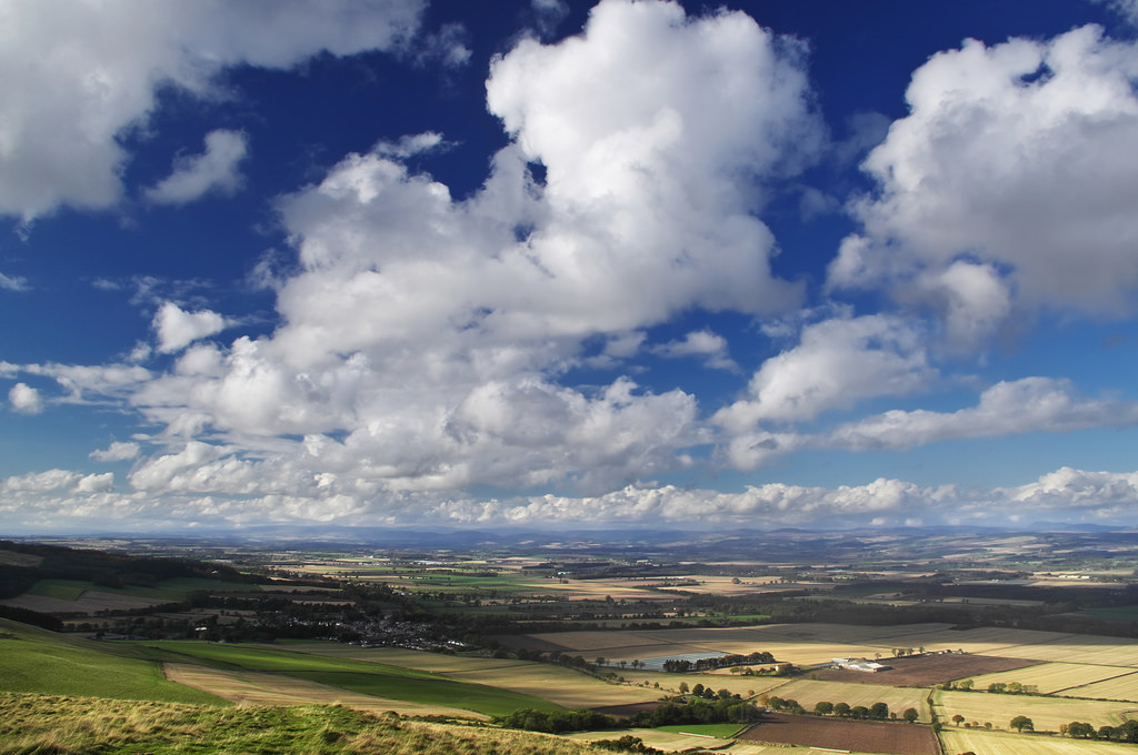
Here are a few examples of where I feel this is the case:


Don’t get me wrong, I think blue skies can work well in certain limited situations which I have shown below. These are usually either when the rest of the photo is filled with similar or analogous colours, or where the blue is used specifically as a complimentary colour to achieve a specific composition.


Curing the Blues
As I said, in most cases I feel that a deep blue sky is detrimental to the composition of many images. So now I will look at a few ways to try and lessen it’s impact. Even if you are a lover of blue skies, some of these may be worth trying as they could be helpful in controlling the composition of your image.
In a similar post, I looked at solving the problems of masses of clashing colours in a daytime shot. However, here I just want to look at the blue of the sky. Although this may seem trite to focus on just one colour, because the sky often makes up a large proportion of an image, altering this colour can have an amazing impact on the image.
Desaturation
As the blue colour is seen as being the problem, the quickest and most obvious way to lessen it’s impact is to desaturate the blue.
I don’t want to labour over the technicalities of how to do this but most image software such as Lightroom, Photoshop and GIMP will easily allow you to alter individual colours.
So lets take an image with an invasive blue sky and strip the blue right out of it.


The colour scheme is more pleasing to me now as the composition now draws your eye towards the area of land rather than to the sky. However, what is left is flat grey areas in sky that look unnatural. These can be remedied by copy the clouds over these areas. I apologise for the crudeness of this but you get the idea.

This is a fairly brutal way of going about things and won’t often provide a great result but it’s quick and easy.
Tinitng
Another way is to directly tint the blue with another colour which is more suitable for the composition. How far you want to go with this is up to you. In this photo I have tinted the sky with orange which has helped neutralise some of the blues saturation and warm the colour up slightly so it is more in keeping with the colours in the foreground.


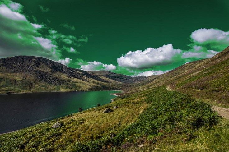
Taking this to extremes, you can make the sky any colour you want if it’s to your liking. Green sky, anyone?
Under a Steel Sky
What I have found to give the best results is a combination of the above two. Desaturation to lessen the impact of the blue and tinting it to a more appropriate colour, this usually results in a steely, greyish blue.

Colour Unification
Another way to lessen he impact of the blue is to try and universally unify the colours in an image. This is quick, often crude, but effective way. In this example, a translucent layer of orange was applied.

Sky Stitching
A more complicated but absolute way of removing blue from the sky is to just stick a new sky on without any blue in it. Here’s a tutorial.


Conclusion
Regardless of your feelings towards blue skies, what they do often represent is a large, dominant body of colour within a photo which can heavily clash with other colours, and also serve as a severe visual distraction. Although you may like it’s evocative, halcyonic context, it may be heavily detrimental to the composition of the image.
As such, why not try playing around with this single colour in your sunny shots. Maybe drop the saturation a bit, maybe tint it a bit, or maybe just get rid of it altogether. You may be surprised by the results.
Thanks for Reading,
Neil


Leave a comment