I have looked at light and dark tonality in previous posts but today I want to expand upon that further at look at it as a compositional element.
When taking photos it is often easy to overlook the tonal range and the tonal contrast within an image. The colours and context of the elements within an image can often serve as a distraction, drawing our eyes and our perception away from the light and dark tones.
Perceiving Contrast
Juxtaposed areas of light and dark create tonal contrast. If you have something which is brightly lit on a background which is dark, there is a significant tonal contrast so the two elements will stand out from each other, as is shown below.
However, contrast can exist in other ways, and these other forms of contrast can often distract us from seeing the tonal contrast within an image. Here are a few examples:
Colour Contrast
Colours at opposite sides of the colour wheel create greater contrast. Because of this, objects which are tonally similar can stand out from each other just because of the colour. Here is an example below. The ladybird stands out dominantly on the green leave, however when the colour is removed we can see there isn’t a huge amount of tonal variance between the objects.


Contextual Contrast
Objects which are contextually different create a perceived contrast. In the example below the ruined castle stands out because it is contextually contrasting to the grass and hills surrounding it. But actually there is little tonal variance between the castle and the rest of the foreground.


Sharpness Contrast
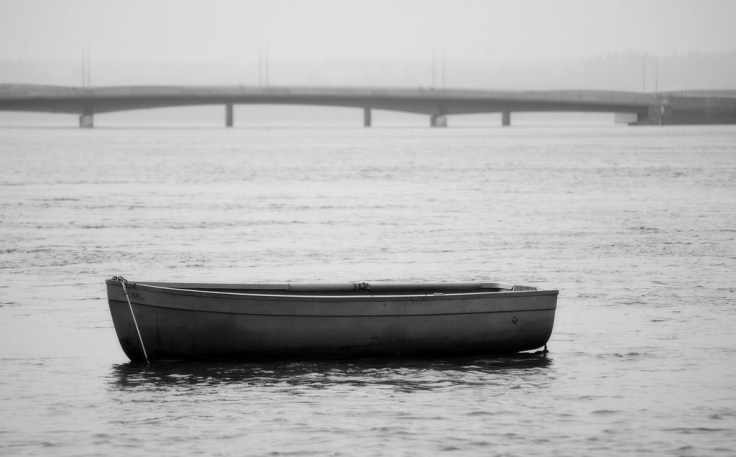
Parts of an image which are sharp create contrast with areas which are blurred. Here is an example. The two boats in the bottom right corner have similar tonality. Now lets (crudely) blur everything around one boat and now see how it stands out.


These are just a few different ways that contrast can be created even when there is little tonal variance.
Why is Tonal Variance Important?
Now this is just a personal opinion but I believe that tonal variance is one of the most important elements in an image. By using tonal variance you can enhance the composition and overall quality of an image significantly, even if there is existing contrast created by colour, context etc. However, as I have said, this is often overlooked when contrasts are created by other means. Without tonal variance, images look flat and lifeless. Thus, because of the power of tonal contrast, I believe it is a fundamental element in the composition of images.
Viewing Tonal Variance
The easiest way to get an idea of the tonal variance in an image is to view it in black and white. This strips out the distraction of colour. However, it does not eliminate other elements such as sharpness and context. You really just have to focus your mind and try and see beyond these elements.
Using Tonal Variance as a Compositional Element
Powerful contrasts can be created through juxtaposing tones and these have a fundamental impact on the composition of the image. As I have said, contrasts can be created by other means but I still believe that dismissing the tonality because of this is likely to be detrimental to the quality of the image.
What I have discussed so far may seem a bit confusing so the best way to show what I mean is to take you through some examples.
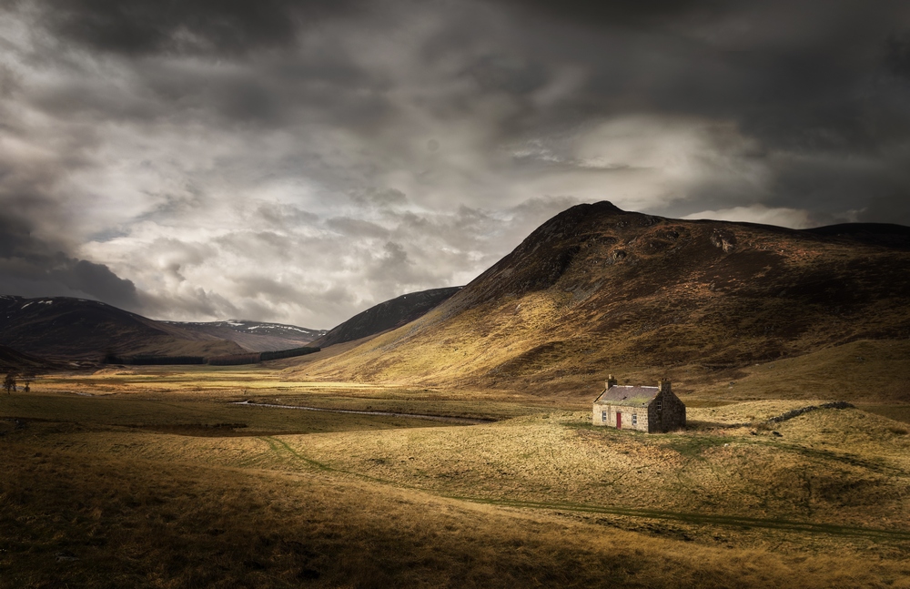
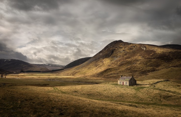
In this first example, we have a small bothy in the hills. The bothy has contextual contrast with the natural environment around it, and the red door creates a slight colour contrast. However, when viewed in B+W you can see there isn’t a huge tonal variance with the bothy and it’s immediate surroundings.


Now the bothy is the obvious focal point of the image but because of the lack of tonal variance I believe it looks flat in it’s surroundings and doesn’t stand out enough.
Therefore, I will edit the image and play around with the tonal variance in it.
I darken down the surrounding hills and foreground, and I lighten the bothy slightly to create greater contrast between them. I also darken down the patch of grass in front on the bothy and the shadow areas on the bothy’s gable end. This creates greater tonal contrast immediately surrounding the front face of the bothy. I also darken down much of the sky but leave a light patch over the left hand side. This contrasting light patch in the sky helps to create a visual balance with the bothy on the right side of the image. It also helps enhance the suggestion of the light breaking through this patch of the sky to illuminate the bothy. Here is the result. The originals are on the left and the amended images on the right. Which do you prefer?


That was a fairly subtle example.
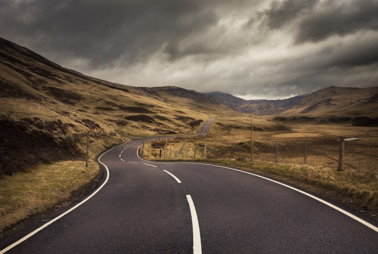
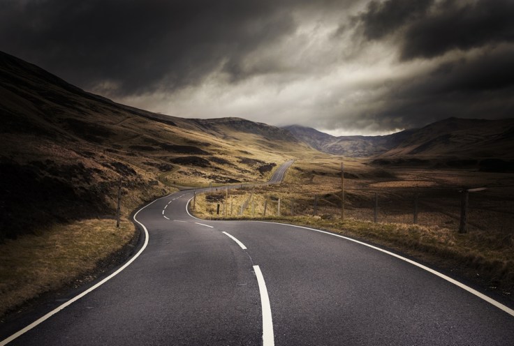
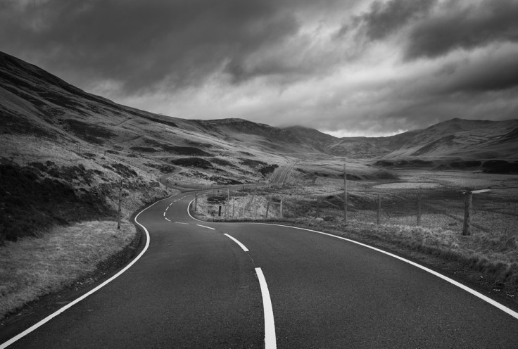
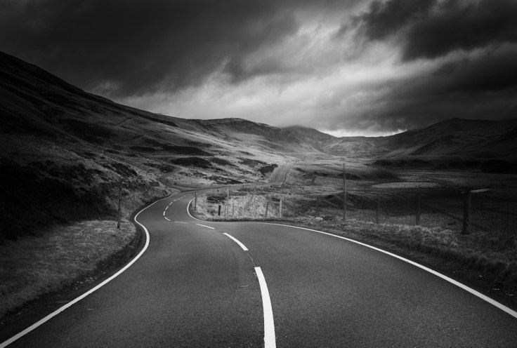
Here is another one. The road leads the eye through the image. There is some colour contrast between the grey road and the surroundings and there is some tonal contrast between the white, striped line but overall it is quite flat.


Lets enhance this by darkening down the landscape next to the road and boosting the contrast between the road and the white stripe on it. This adds more emphasis to the road. By doing this, I have effectively created a channel of light which leads the eye through the photo with the road. Here is the before and after:
I hope these examples have illustrated the point that even when contrast exists in an image, there can be a lack of tonal contrast. By manipulating this tonal contrast you can control the composition of an image.
Inversion
Because tonal contrast creates powerful compositional elements in an image, there may be times when these make an unwelcome appearance in an image. This is especially true in landscape images where you have little control over the light source. When you have these unwelcome tonal contrasts, reducing the contrast between these areas will naturally reduce their prominence.
How do you do it?
Depending on what and how you are shooting you may be able to significantly control the tonality in an image at the time of capture. There are a plethora of things you could use from filters to flashguns. However, if you have an already captured image that needs a bit of tonal manipulation you will have to use post-processing software such as Lightroom, Photoshop or GIMP.
Dodging and Burning
In the post-processing software you will be doing dodging and burning. These are terms from the days of film cameras but it now basically means localised lightening (dodging) and darkening (burning). Their are a mind boggling number of different tools and procedures you can use for dodging and burning even in a single package like Photoshop. You really have to look around to see how to do it and what tool works best for your specific purpose. In a future post I will look at some of the different techniques out there.
Keeping it Real
When doing significant dodging and burning there is a danger that the end result will look unnatural and smack of poor quality image manipulation. The best way to avoid this is probably just to have a keen eye and don’t do anything which looks to you highly artificial. However, a good quick tip when doing this is build it up slowly. Use a soft, low opacity brush and do the dodging and burning with numerous strokes rather than using a harsh brush and trying to do it in one stroke.
Using the Histogram
I haven’t mentioned the histogram yet. I talked about it’s invaluable use in a previous post, however it can have limited use when using tonal contrast as a compositional element. The reason being that it shows the spread of lights and darks across the whole image whereas when doing these type of tonal adjustments you are more concerned with local contrast, which can often be hard to discern from the histogram. However, it is always worth checking it especially if you are doing tonal changes just to see the overall tonal range within the image.
Conclusion
Contrast is a powerful compositional element. It can be created in many different ways but, in my opinion, one of the most powerful is tonal contrast. However, it can often be overlooked when there are existing contrasts created by colour, context etc. So when you are editing your image and want to create strong compositional elements such as drawing attention to a focal point or creating a leading line, look at the tonal variance within the image and try to alter it to suit your artistic vision.
Thanks for Reading,
Neil


Leave a comment