Digital photography has brought in a host of new features to assist us in capturing our desired masterpiece. One of the most useful of these, and also one of the most overlooked, is the histogram.
What is the Histogram?
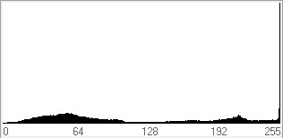
In photography, the histogram is a graph which shows the distribution of tones across an image. Below is an example of a histogram.

Each bar in the graph represents a different tone with darker tones to the left and lighter tones to the right. There are 256 different values ranging from 0 on the far left which is pure black or zero luminosity, to 255 on the right which is pure white or maximum luminosity. The height of each bar in the graph represents the amount of pixels at that tonal value. The higher the bar the more pixels there are. If there is no bar at a certain tonal value, then the image contains no pixels of that specific tone.
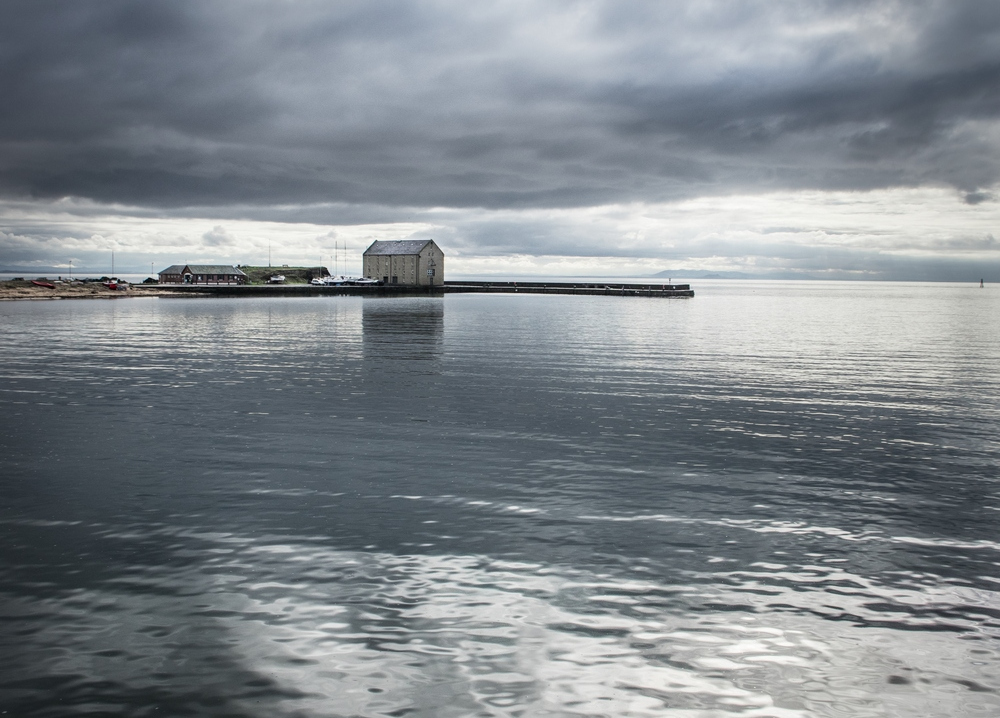
The above histogram was taken from the image below.

As you can see from the histogram, the image has a fairly even distribution of pixels across most of the tonal range and this can be seen when viewing the photo.
Here are a few more examples to help understand the histogram further.
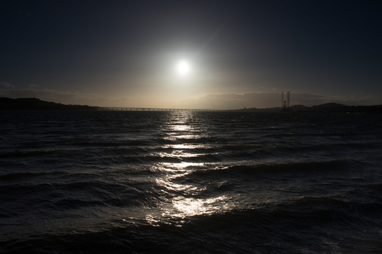

The image above was shot directly into the sun causing the majority of the photo to be underexposed. The histogram shows this with a large spike to the left which represents this mass of dark pixels.


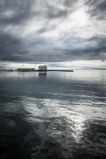
The above image was taken in dense mist giving a fairly dull, flat image. The histogram shows this with a spike in the darks, which is the land mass, and a spike around value 192 which shows the lighter mist. There is nothing on the far right of the histogram as there are no bright sections in the photo.
Extreme Exposure
The next photo was shot towards the sun. This has resulted in the sky becoming an overexposed sea of white.
The histogram shows this with a huge spike at the furthest right. What this spike tells us is that the massive white area in the sky is all at the single tonal value of 255 (maximum luminosity) which makes it a flat block of a single colour. This is often called a ‘blow out’ and it means all image data is lost from this part of the photo. If you tried to rectify it by reducing the overall brightness of the photo, it would still remain a single flat block of colour.
You can also get the same with an underexposed photo with a large spike at tonal value 0 (0 luminosity) which represents a flat block of pure black.
From experience, your camera is far more likely to blow out areas than it is to totally underexpose areas. I will show this with the example below.


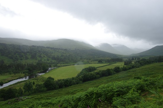
The above image has huge underexposed areas and it may seem that all image data is lost in these areas. However, the histogram does not show an extreme spike at the lowest value but it does show some slight tonal variation in these dark areas. Thus, if you lighten the image you can bring this out and it will not remain a flat block of colour.

The image with the shadows lightened. Although it is far from visually pleasing, it does illustrate that image data was still available even in these extreme dark areas, as was shown in the histogram.
Histograms are Everywhere
The histogram really is a ubiquitous tool in photography. Most cameras from the highest spec down to budget compacts will have the option to show a histogram of the images you have captured when you review them. Some cameras also have live histograms which display a dynamic histogram of the image before you even capture it.

In addition to cameras, most image viewing software and image processing software will have a histogram. In Lightroom, you can even alter the image by interacting with the histogram directly.
Why is the Histogram useful?
Hopefully, I have managed to effectively show the function of the histogram, but why is it such a useful tool? Why not just use your eye and judge the tones that way?
The first reason is because you can’t always be sure what you are looking at is an accurate representation of the image data. Unless you have a perfectly calibrated display, how an image appears on screen can differ considerably between devices. Most displays will have a host of adjustable settings which alter how the picture is displayed, and on some devices like LCDs the picture looks different just by the angle you view the screen at. Thus, it is often hard to know if what you are looking it is accurate. The histogram however, does give an accurate representation of the tonal values within an image and understanding how to read a histogram can be invaluable in overcoming inconsistencies with displays. Try viewing the same image on your mobile and then on your TV and you will likely see what I mean.
The next reason is because your eyes play tricks on you, especially with colour images. Differing colours viewed next to each other can trick you into believing there is more or less contrast in the tonal range than you believe. You can overcome this by using black and white tonal maps which I will talk about in my next post but using the histogram will let you understand the tonal distribution better.
Lastly, is because of the concept of ‘linear capture’. I will discuss this in depth in another post but suffice to say digital cameras provide more contrast in images than your eye sees. This is less of a problem if you are using a live viewfinder as you can see how the final image will look before you take it, but can be a big issue in optical TTL (through the lens) viewfinders. Using the histogram as you take your images can help you understand this tonal difference.
What is a good or bad histogram reading?
This question dives into the murky waters of what makes a good photo, a highly subjective topic that could be discussed forever without reaching a conclusion. However, there does tend to be some agreement about what many find pleasing in an image.
Images with a wide tonal range are unusually considered better than those with a narrow range. I have heard that some photographic agencies wont accept images that don’t cover a minimum percentage of the histogram. Using two examples you can see the difference.


The first image is unprocessed and shows a narrower tonal range and few bright areas. The second image has been processed to expand the tonal range. Which do you prefer?
Another thing which is not seen as desirable are the extreme exposures discussed above. Large blown out areas or a sea of black underexposure are probably best avoided unless it is done deliberately for a specific artistic effect.
Therefore, a good histogram reading would be seen as one that has data covering the majority of the tonal range and doesn’t have huge spikes at the lowest or highest values but this really is down to personal preference.
So there you have it. The histogram is a widely used and extremely helpful tool in digital photography. It is fairly simple to read and gives you access to the full tonal information of your image meaning you can better understand the image’s make-up and better plan for any adjustments you decide to make to it.
Thanks for Reading,
Neil


Really helpful post! I must use histograms more
LikeLike
Thanks. Glad you liked it
LikeLike