
Trying to assess what is the most important element in a photograph, or any other piece of visual art, is difficult because it is dependent on the individual piece and the personal preferences of the viewer. e.g. someone may like the colour in photograph, another may like tonality in another. In addition to this, there are so many different ways you can break such a piece into individual components. Tone, colour, contrast, sharpness, context, mood…. to name but a few. So to make a statement like ‘composition is king’ may seem fairly sweeping.
What is Composition?
Before looking at this, it is probably best to get some definition of what composition actually is.
Wikipedia defines composition as “In the visual arts, composition is the placement or arrangement of visual elements or ‘ingredients’ in a work of art, as distinct from the subject. It can also be thought of as the organization of the elements of art according to the principles of art.”
Is that vague enough? In short, it is how the visual elements are arranged without considering the subject matter. Thus, I think it is then fair to say we can break down a piece of visual art into two distinct components. Composition and Subject. If you have read any of my previous posts you will know that I don’t put a huge amount of weight on the importance of the subject matter and context of a photograph, mostly because in most photos (my own included) the subject matter is usually superficial and trite. Thus, it is little wonder I would put so much importance on composition.
Subject Weighted Photos
Many people seem to put considerable weight on the subject and often disregard composition in the process. Subject weighted photos are fine if, for instance, it is pictures of a party you and your friends attended and you are sharing them with your friends. Or if it is a subject matter you are deeply interested in, such as train spotters viewing photos of trains. But more often than not, if you don’t have a certain personal attachment to the subject matter, these photos appear bland and uninteresting. Why? because the composition is poor.
Here are few examples of some of my photos which illustrate this.
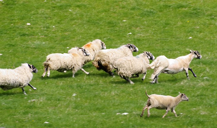

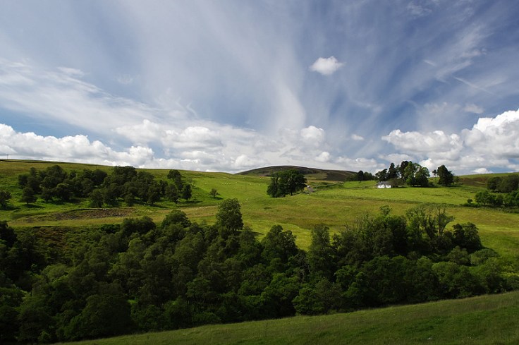
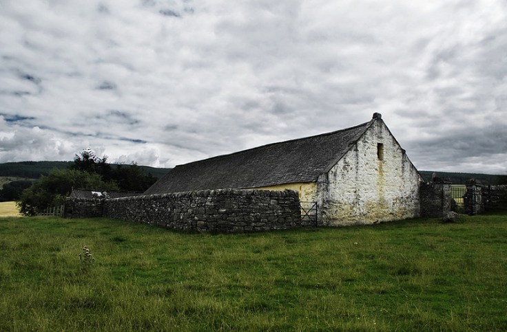
All the above photos have weak compositions but may be of interest if you like the subject matter.
Composition Weighted Photos
Now lets try some photos which I have paid little regard to the subject. The subject matter may have relevance to the individual but it was not a primary consideration when taking the photo.


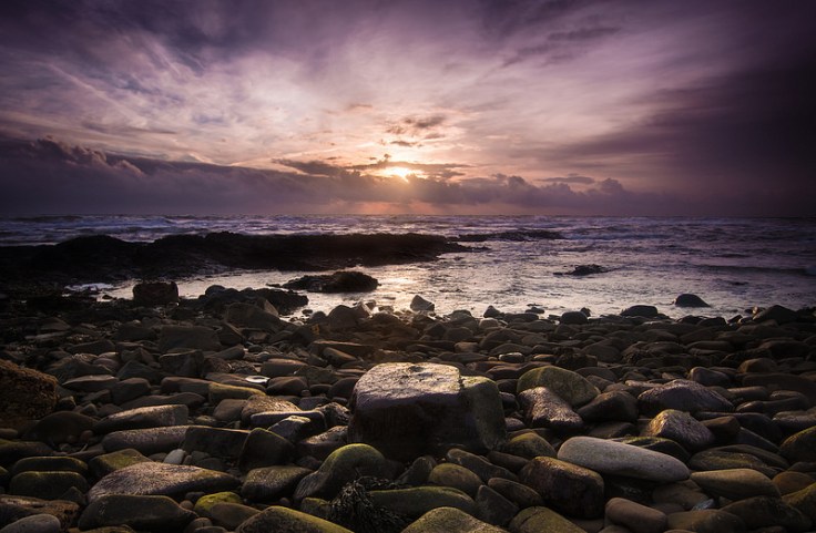

The above images do not have any greatly interesting subject matter but I have focused on creating interesting compositions so hopefully you find them more visually pleasing than the other.
Composition v Subject
So therefore it begs the question does composition ever have to be disregarded even if it is an interesting subject? I would say no. Every visual image has a composition and to not pay any attention to this element is just disregarding a fundamental element that contributes to the overall interest and appeal of that image. I appreciate in some cases you may limited time and poor photographic conditions yet you still want to get the shot. However, people just disregard composition because they don’t understand what can make a good composition, or at least don’t understand how the various visual elements in a photo contribute to the overall composition.
In previous posts, I have mentioned some of the common compositional tricks that many seem to find pleasing in an image, and in future posts I will discuss more of these. However, I urge anyone taking photographs to always pay heed to the composition of the image and don’t focus solely on just the subject matter. In fact, I would recommend giving more attention to the composition than the subject. Regardless though, a little bit of thought put into the composition can be the difference between a good or a poor image.
Thanks for Reading,
Neil


Leave a comment