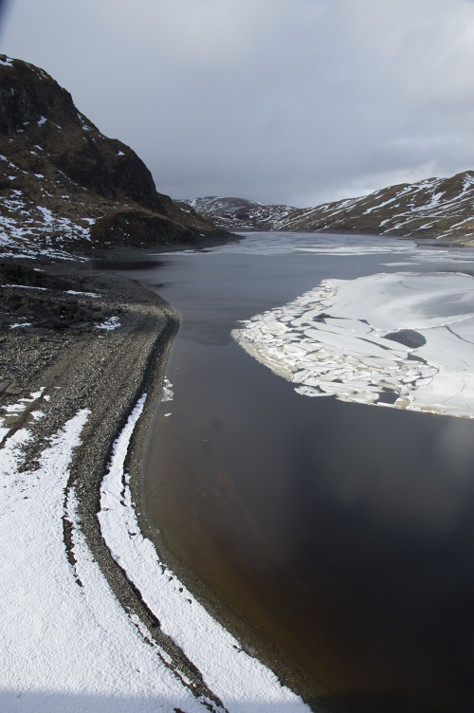
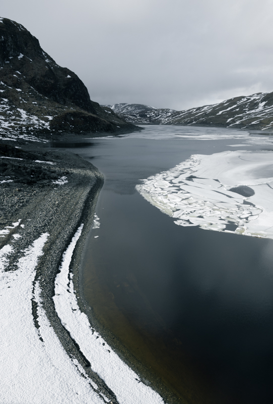
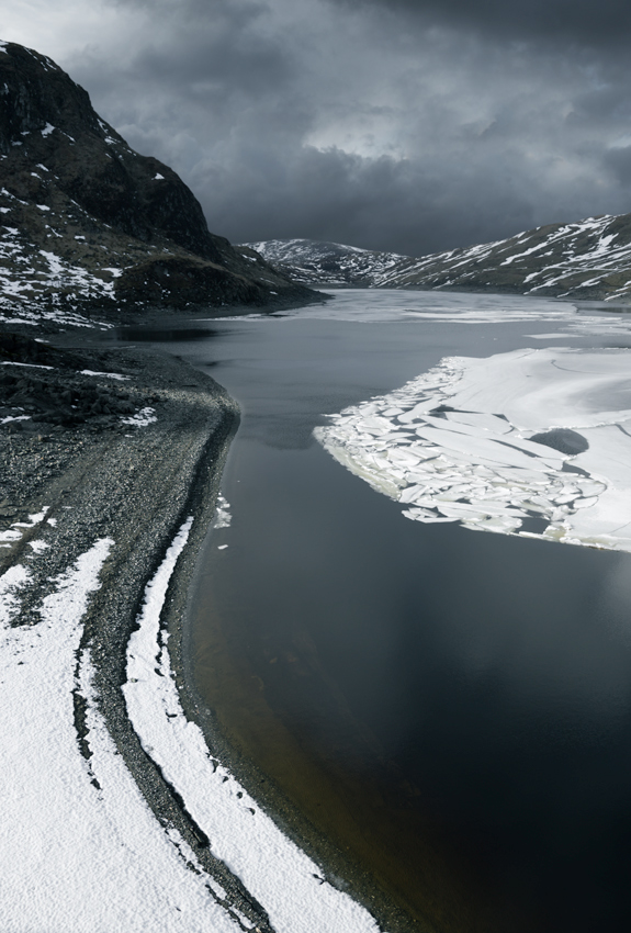
I was up at Lochan na Lairige, a large dammed loch near the Ben Lawers mountain range in Perthshire. Although the weather was quite mild, the loch still had huge sheets of ice floating on it. The loch and the Ben Lawers dam next to it is picturesque at any time but with sheets of ice floating on the water, it was real photographic fodder.
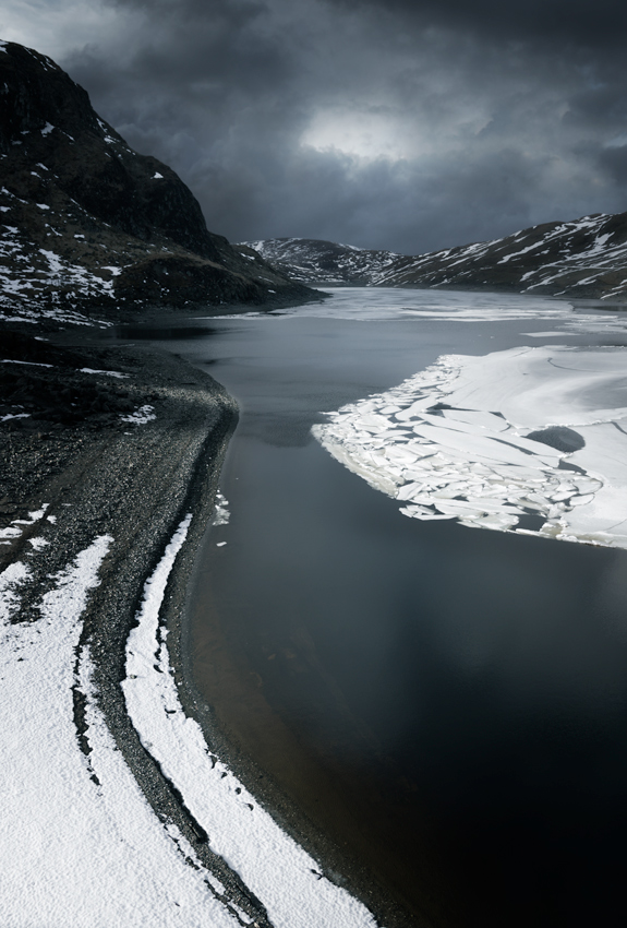
I took a lot of shots of it as the weather turned from sunny skies to dark rain clouds. In the end I liked this photo the most (below). The curve of the shore leads the eye towards the hills in the background and the light is catching the shore and ice sheet nicely.
Although there is sunlight illuminating the foreground, the already darkening sky suggests that a dark, moody appearance would suit this image, so I will process it towards this end.
Although it may seem strange to having a dark, stormy sky on an image which has the foreground lit by bright sunshine it can often work quite well as it implies light rays breaking through the dark sky, although these need not be visible in the final image.
So in this tutorial I will do just that and make a dark brooding sky over a well sunlit foreground.
Post Processing Roadmap
First off, I will make a basic roadmap of the main adjustments needed to the photo:
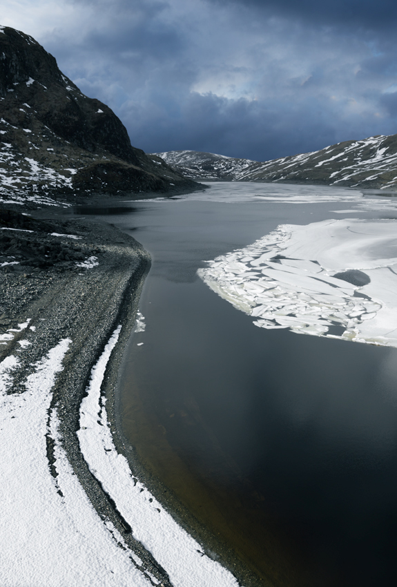
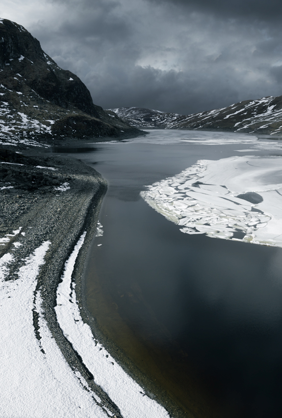
Cropping and Rotating: The photo feels too loose with too much dead space. There is also a distracting shadow at the bottom and something which has darkened the top left corner. Thus, some small scale cropping is needed. It could also do with a slight rotation clockwise as it appears slightly squint to my eye
Sky Replacement: Although the current sky is quite dark and ominous, it is way too flat and textureless and it is just a void of dead space in the image. Therefore, I will need to stick a different sky on it.
Colour Grading: The browns in the hills appear too warm for my liking. So I want to push the colours more towards a cool, steely blue to emphasise the dark, stormy nature I want to create.
Enhancing the Stormy Appearance: I also want to do various other alterations which will enhance the stormy appearance of the image. I will discuss these in detail below
Working in Lightroom
I always do the initial work in Lightroom as it lets you work on the RAW file and the extra image data contained within it.
Cropping and Rotation
I crop the image to reduce some of the dead space and make it feel tighter. This also removes the unwanted shadow at the bottom and the darkening in the top-left corner.
Without a straight section of horizon line it is often hard to tell if an image is squint or not, so you really just have to judge it by eye. I feel this could do with a slight rotation clockwise.
Creating a Steely Colour
The browns of the hills and the other overall colours feel to warm for the scene I want to create. So I splice a steely blue colour into the shadows using the split toning function. I also reduce the colour temperature slightly to emphasise this cold, blue feel. Lastly I drop the blue saturation in the image as it appears too vibrant after the previous colour adjustments.
Brightness and Contrast
The image feels slightly too dull and the histogram shows little image data in the far right (brights). So I subtly increase the exposure and give the image a slight contrast boost.
I like the way the image is looking now. I have created the steely colour I was looking for and the composition feels tighter. So, the next step is to stitch a new sky into it. And for that I have to use Photoshop which is what I will use for processing the rest of this image.
Sky Stitching
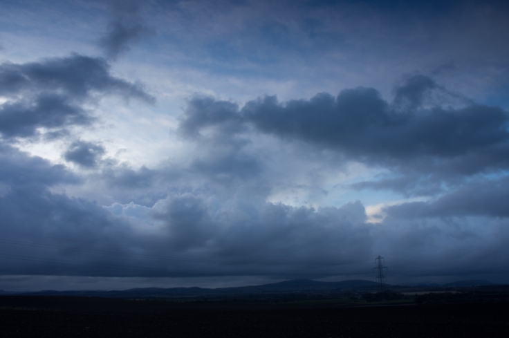
The sky within the image is totally flat and textureless so I want to just replace it with a totally new sky from another image.
I have picked this one out as it is nice and stormy looking with plenty of texture. It also has a similar blue hue.
I did an in depth tutorial on sky stitching in Photoshop which can be found here, so I wont go through it again.
I cut out a section of the sky from this photo, scale and resize it to suit and then paste it into the image. Here is the result:
Enhancing the Sky
As you can see, the new sky definitely has more texture but it also looks quite out of place, so it will now need to be altered to make it blend better.
Colour Grading
The most obvious issue with the sky is that it’s blue hue is far too saturated compared to the rest of the image. So I desaturate the blues quite a bit. I also push the colours very slightly towards cyan to bring it closer to the colour of the water.
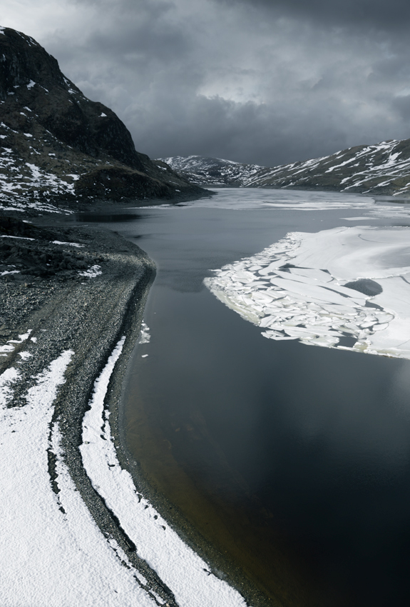
Making the Sky Stormier
Although it has a lot more texture than what was there before I still think the new sky could do with looking even more stormier so I darken it down slightly.
The sky looks much better now and merges relatively harmoniously with the rest of the image.
Dodging and Burning
I now want to start enhancing some of the details within the image using some selective dodging and burning. As the sky is on a separate layer to the rest of the landscape, I will work on them individually.
The Landscape
First, I will do some dodging and burning on the landscape layer. I will darken down the mountains in the background as they appear to bright under the stormy sky, and also darken down some of the shadow areas in the water.
The Sky
The sky appears too dark over the far off hills in the center and right of the photo, and too light over the mountain on the left. So I will alter this with dodging and burning. I will also enhance the light burst in the sky by lightening it slightly. This light burst helps provide a bit of visual balance with the sky and the bottom section of the image as it is where the shoreline leads your eye towards when viewing it.
After stitching on a new sky it can often be hard balancing the exposures on the two separate layers as it is difficult to guess which parts would be lighter and darker under the new sky. You really just have to use your judgement and see how it looks with different changes. Anyway, I am happy with this now.
Dark Vignetting
I now want to add some dark vignetting to the image to increase it’s moody, dark feel. I use a levels adjustment to darken down the image and then paint it through to selected areas with a layer mask.

Lightening the Center
As is often the case after adding dark vignetting on an image, the center can look slightly too dark. So with a curves adjustment I lighten the center slightly.

Blurring the Hills
The hills at the back feel like one continuous progression running right across the image although this was not the case. To break them up slightly I add a slight gaussian blur to the far off hills in the center and right. This also helps create a feeling of distance recession.
Finishing Touches
A few small tweaks to finish it off. I slightly desaturate the yellow area of beach at the bottom of the photo as it’s colour looks a bit out place with the steely, blue-greys. I also do some sharpening in the foreground and give the overall contrast one final tweak.
And here is the final image with the original capture next to it.


I hope this tutorial has been helpful in showing that you can add dark, stormy skies to sunlit foregrounds and still get a result which looks fairly realistic and natural, and all with a relatively small amount of post-processing work.
Thanks for Reading,
Neil


Nice one.. I enjoyed reading this😘
Check out my new post.. Its on how to add a touch of silver to your dressing..
https://tinutrends.wordpress.com/2018/05/02/highlights-of-my-week/
LikeLike