Following on from my last post discussing histograms, I now want to quickly look at what I call tonal maps.
When viewing an image, the colours within it can often deceive us into believing there is more or less tonal variance within the image than there actually is. Complimentary colours create greater contrast whereas analogous colours create less contrast. The histogram is one way to accurately see the tonal variation but the limitation of this is that it only shows the distribution of tones in the form of a graph, it does not show the tone of each individual pixel within the image itself. This is where a tonal map comes in useful.
What are Tonal Maps?
A tonal map is basically a greyscale copy of the image. With most of the colour information removed you can more accurately see the tones within the image without the interference of the various colours. Please note this is totally different to the process of ‘tone mapping’ which is used in HDR processing.


How do you create them?
There are many ways this can be done depending on the software you are using. You can use a saturation function and reduce the saturation to 0, or alternatively use functions such as ‘black and white’ or ‘greyscale’. These will all produce tonal maps of your image. However, it is worth noting that different functions apply different algorithms which produce different results. e.g adding a hue/saturation layer in Photoshop and reducing the saturation to 0 produces a different outcome to adding a black and white layer. The best function for producing a tonal map is the one that most accurately represents the tonal variation within the colour copy of the image. This can be judged by comparing the histograms of both images (the colour copy and the greyscale copy) and if the they are similar, it is an accurate tonal map. I use a hue/saturation layer in Photoshop and reduce the master saturation to 0 and I find that works well.
Why use Tonal Maps?
By more accurately seeing the tonal variance in an image you can see what areas have too much or too little tonal variation and apply changes accordingly.
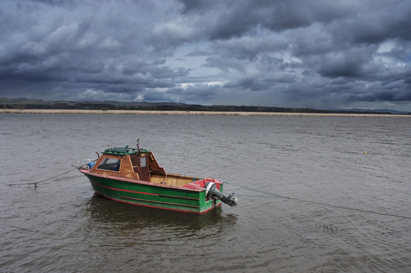
Using the above image of the boat, I find the tonal map shows me that the brooding clouds in the sky lack contrast and that the boat does not stand out from the water enough. Thus, I add more contrast to the sky, darken down the shadow areas of the boat, and increase the local contrast of the boat.


The changes I have made to the image are just to my personal preferences. However, what I hope it does show is how useful using a tonal map was in identifying areas in the photo that I felt lacked tonal variation, and targeting the changes I made accordingly.
I would recommend using tonal maps during the editing of all your photos. You can quickly view them with a few clicks and they can provide invaluable information which helps editing your image.
Limitations
The main limitation of this process is that it is dependent on the accuracy of your display’s calibration. If that is off then the image will not appear accurately irrespective of whether it is on colour or not. As the histogram is unaffected by your display calibration it is worth using it in tandem with tonal maps to get accurate and easy to understand tonal information of your image.
Thanks for Reading,
Neil


