
In a previous post, I showed how to stitch a new sky into an image using Photoshop (PS). The post focused mostly on the steps required to cut out and stick on a new sky. At the end of the post I touched upon some techniques which can help the new sky blend into the photo. In this post processing tutorial I want to elaborate on some of these techniques further.
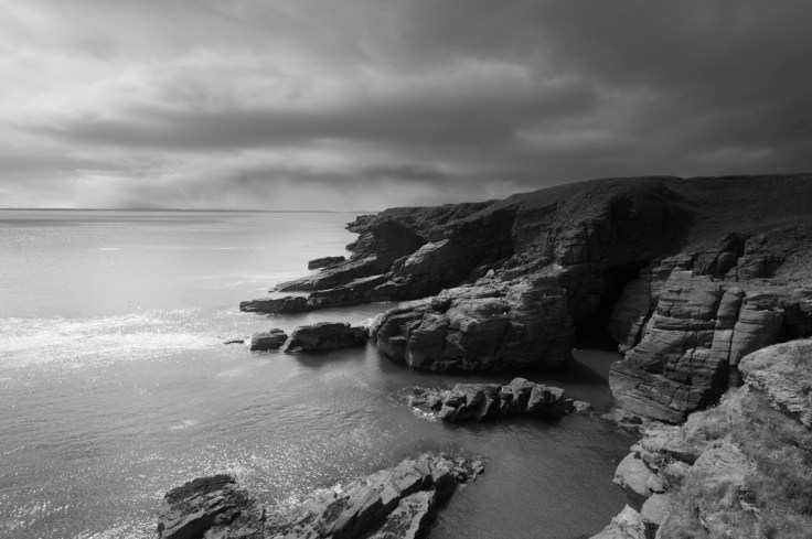
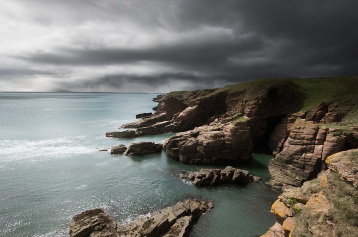
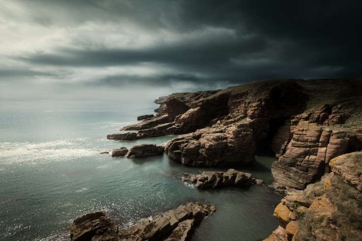
Here is the image I have selected to work on.
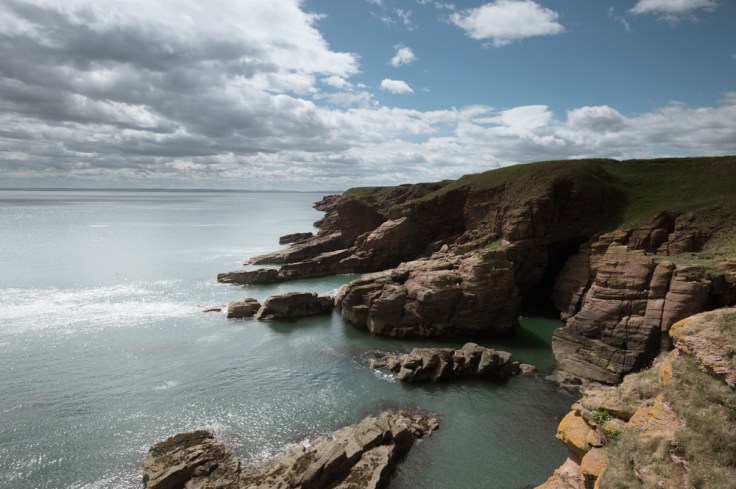
It is a picture of the cliffs at Arbroath in Scotland. It was taken on a bright sunny day and I had a hard grad filter on the camera to help darken down the overly bright sky. This has led to a fairly balanced exposure. Now I could leave the sky as is but i don’t like the flat patch of blue in the top right corner, it appears incongruous with the rest of the image and it unbalances the composition by dragging your eye up to this corner. Instead of trying to edit the current sky, I feel it is best just to add a completely new one which I feel is better suited.
Apply the Sky
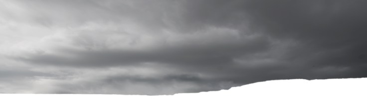
In my previous post I covered how to choose a suitable sky and how to stitch it on with PS so I won’t go over that again. Here is the sky I have chosen for the image.
I chose this sky because it mirrors the scene in the photo, albeit it will do when when i flip the image over. The shaft of light coming in from the side will look like it is illuminating the cliffs, and the darkened area will sit well above the darkened area over the cliffs on the far right of the image.
Here is the sky cut out and flipped over and stretched a bit to fit.
And her it is stitched on to the photo.
It is clearly obvious looking at this photo that the sky is stuck on as it looks totally incongruous. However, I feel that the sky fits well with the image, it just needs a bit of work to help it blend in. So now I want to look at the various issues to address when getting a sky to blend in.
Exposure Balance
For the stitched sky to look natural you want it to have a suitable exposure for scene. This can be tricky to do sometimes as the sky’s exposure can often often be markedly different to that of the foreground.
A good way to assess exposure to create a tonal map which is basically a black and white version of the image. I have discussed tonal maps here if you need some help with them.
Anyway, here is a tonal map of the image and it is far easier to now see exposure problems between the sky and foreground.
The sky appears too dark on the left side. The patch of specular highlights in the water suggests very bright, strong sunlight illuminating this area, so the sky has to be brightened here.
In addition, the sky appears considerably lighter than the darkened area of cliffs on the right so I would want to darken down the right side of the sky to help it blend in. Here is the result both in the tonal map and the colour image.
In addition to altering exposure in the sky, exposure can also be altered in the foreground. This can often be a slightly back and forward process until you get a good result.
Contrast Balance
This ties into the above category of exposure balancing but instead of looking at the exposure in certain parts of the image, you are looking at the overall contrast in the image.
Again it is probably best to look at this with tonal maps. Here is the original image with the initial sky stitch.


You can clearly see the foreground has a stronger contrast than the sky. Now I will apply the exposure changes from the above section.


These changes have not only provided a better exposure but have also boosted contrast in the sky to make it similar to the contrast in the foreground.
The only thing I notice is that the area of rocks on the far bottom right looks slightly flat so I will tweak the contrast here.


Now the exposure and contrast looks quite balanced and natural across the whole image.
Colour Balance
Now we want to look at the balance of colour between the new sky and the foreground. This is probably one of the most common problems that has to be addressed when stitching a new sky on. Often the colours of the existing foreground and the new sky will not merge well. This can be due to different lighting conditions, different white balance settings on the camera, or just a clashing colour scheme between the two images.
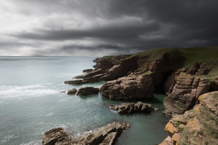
Looking at the image it is clear that there is a problem here.
The sky is grey and monochromatic whereas the sea is a pale turquoise. As the water merely reflects the colour of the sky, this new sky does not fit in.
What I have to do is get the colour of the water and sky to be similar. I can do this one of two ways, either by pushing the colour of the sky to one similar to that of the water or vice-versa.
Surprisingly for me, I quite like the pale blue colour of the water so I will splice a similar colour into the sky to make it a more compatible colour tone.
Here are the colours of the sky looking more similar to that of the water.
Watch the Highlights and Shadows
Just a side note. When colourizing a greyscale image such as this sky you have to pay particular attention to the highlight and shadow areas of the existing foreground image. In this case, the darker areas in the water are blue but the highlights are white. This has to be mirrored in the sky or it will look unnatural. It’s easy when colourizing to have the applied colour affect the full tonal range of the image. In this case, it has to be constrained to the darker areas so the highlights remain white.
Universal Colour Changes
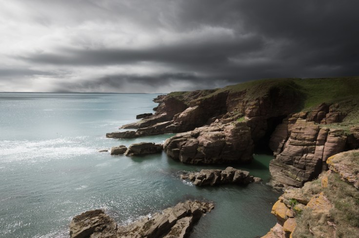
Now that the colour of the sky and foreground are similar, universal colour changes can be applied to the whole image. In this case I have slightly desaturated the colours as they are quite bright, and added a faint sepia filter to help unify the colours across the whole image and take some of the saturation further out of the blues.
Sealing the Joins
Now that the exposure, contrast and colour are balanced you would think the sky would be a perfect, seamless fit for the foreground but as you can see it is not. From a quick glance you can see that there is something not quite right.
The problem lies with the edge join between the sky and foreground. When joining two images such as this, the transition between the edges has to be smooth and natural. Looking over this image, the transition between the new sky and the cliffs, on the right of the image, looks fine. However, the transition between the sky and sea on the left of the image looks terrible. There is a thick dark line which looks unnatural eventhough, in this case, it is actually the distant coastline and not an anomaly which has crept in through processing. In addition, there is a dark streak in the water near the joining area, and the light and dark areas of the clouds near the join don’t mirror the light and dark areas of the water just below them.
There are numerous ways you could deal with this problem but my favourite way is to add some fogging along this join. As the problem area is seen as the distant background in the image, a little fog there wouldn’t look unnatural and it would help hide this awful joining seam.
So by taking a colour similar to that of the sky and water, I gently brush over the area with a soft, low opacity brush. I brush this area over and over again to build up this effect. And here is the result.
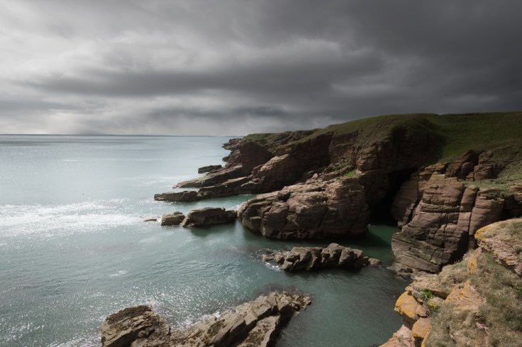
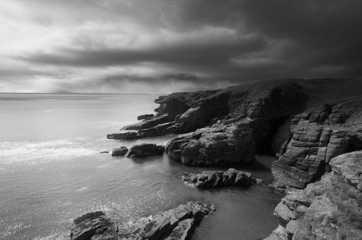
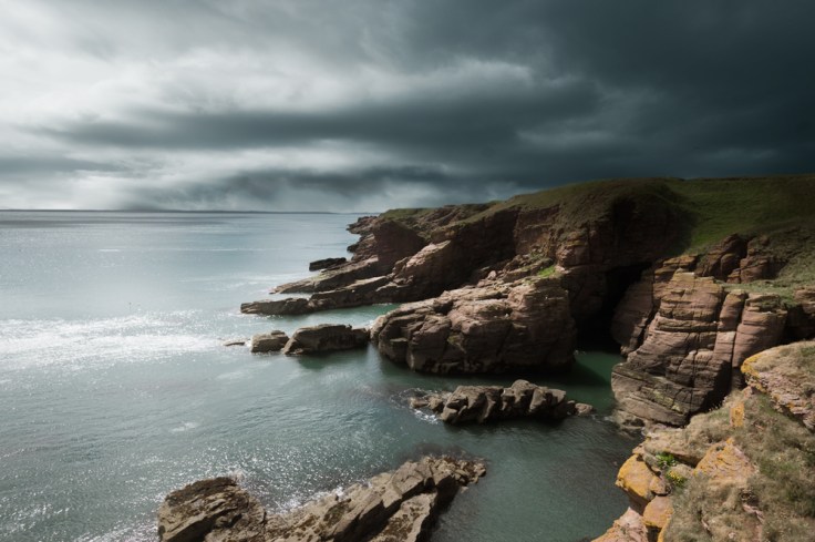
And that is about all that’s needed. The sky now blends well with the foreground. The exposure, contrast and colour have been balanced between the two images and the harsh edge tidied up. The result is a sky which looks natural and appears to be part of the original photo.
All that is left to do now is to run through the usual post-processing stuff. I vignette the edges to put more emphasis on the cliffs in the middle of the photo, and I give the contrast and sharpness a little boost. And the image is complete.
Conclusion
My previous post on sky stitching looked at selecting the right sky for stitching in, and ran through the steps required to do so in PS. This post has looked at some post-processing techniques to ensure the applied sky blends naturally into the exisitng foreground image.
By looking at balancing the exposure, contrast and colour, and by ensuring a natural seamless edge you should be able to make a slightly incongruous sky blend into an image naturally.
One last thing. The processes I have shown here are not just useful for images where you stitch a new sky on. They are also really useful for existing skies within an image. Many times when you take a landscape photo the sky will just not look right, so try applying some of these techniques and it may make a big difference.
Thanks for Reading,
Neil


Leave a comment